Pittsburgh Steelers Rebrand
Building on the legacy and pushing toward the future.
“We don’t abandon tradition, we build on it.”
“We don’t abandon tradition, we build on it.”
The Logomark

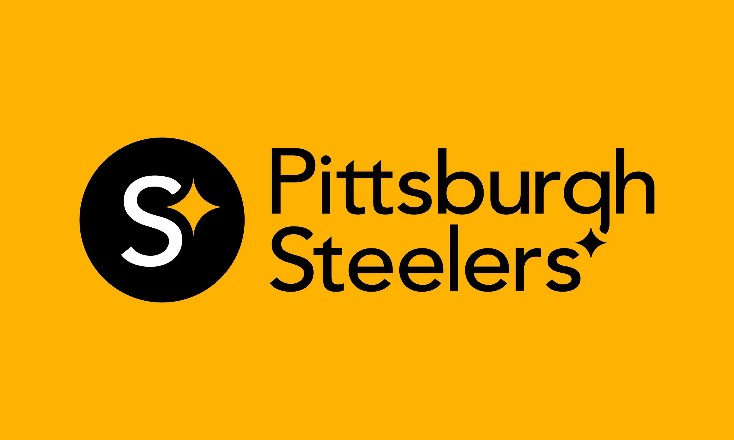
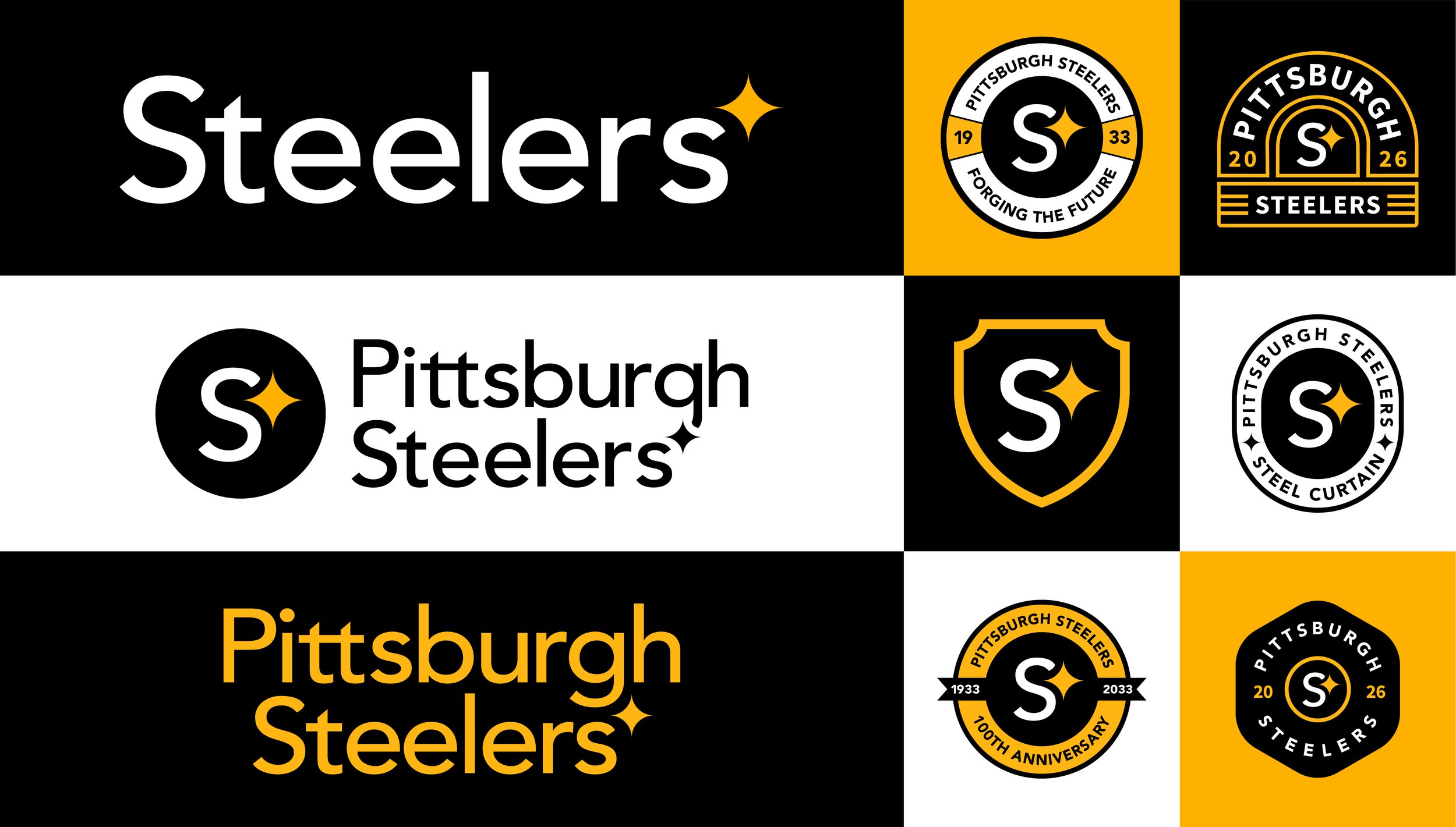
The revamped logo blends recognition and historic symbolism. The three main colors fit seamlessly into the brand identity. A clean slate is left of the S for Steelers and a single hypocycloid, tying back to Pittsburgh’s Steel Industry.

The Color Palette
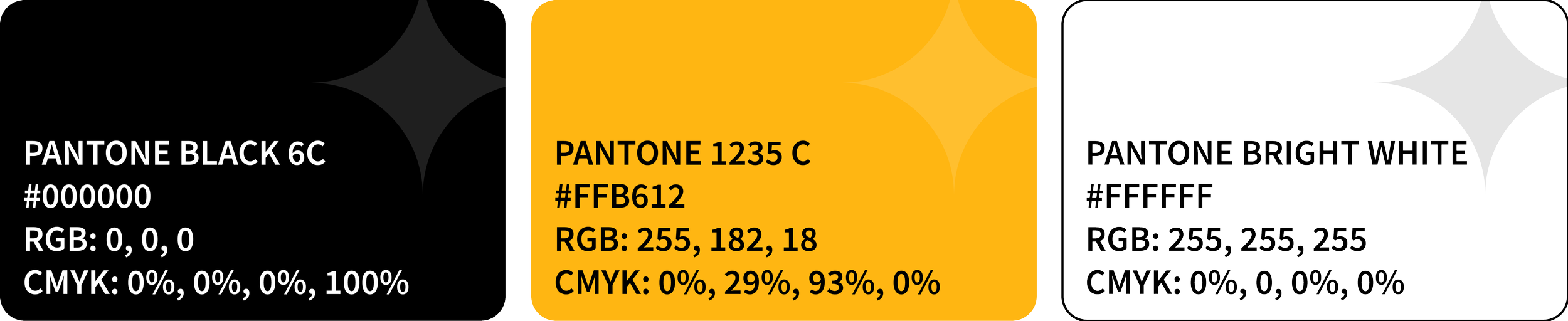
Colors associated with the brand are black, gold/yellow, and white. Keeping it crisp and simple for content across multimedia channels and tangible deliverables.
The Logo System
Logotypes, Emblem, Badge, Crest, Seal, Anniversary, Patch
The Gear
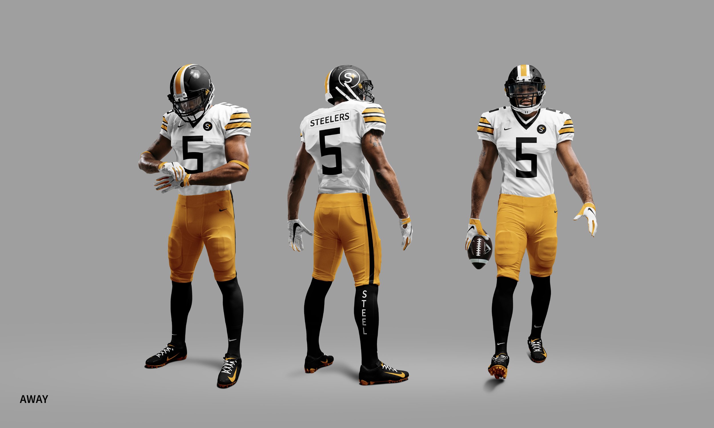
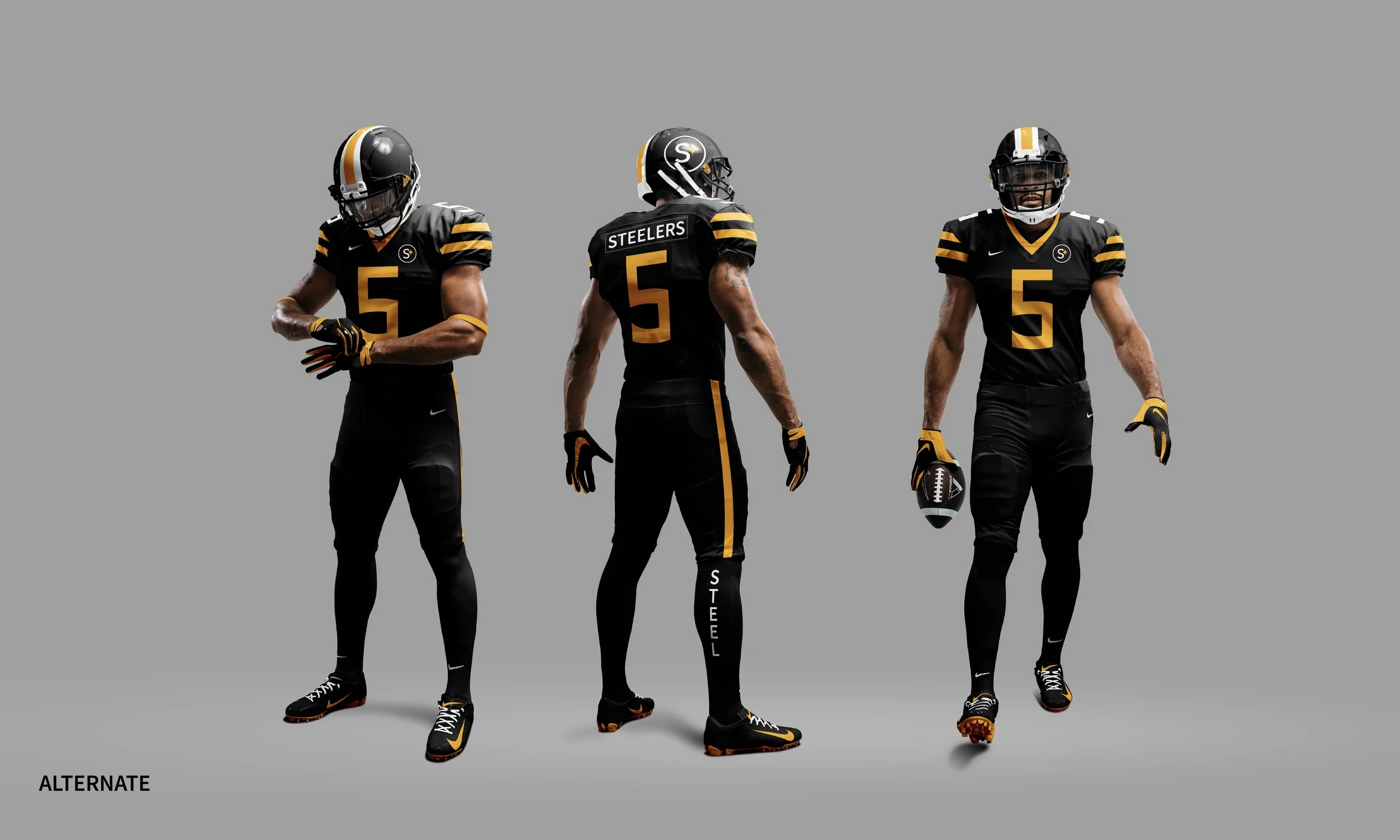
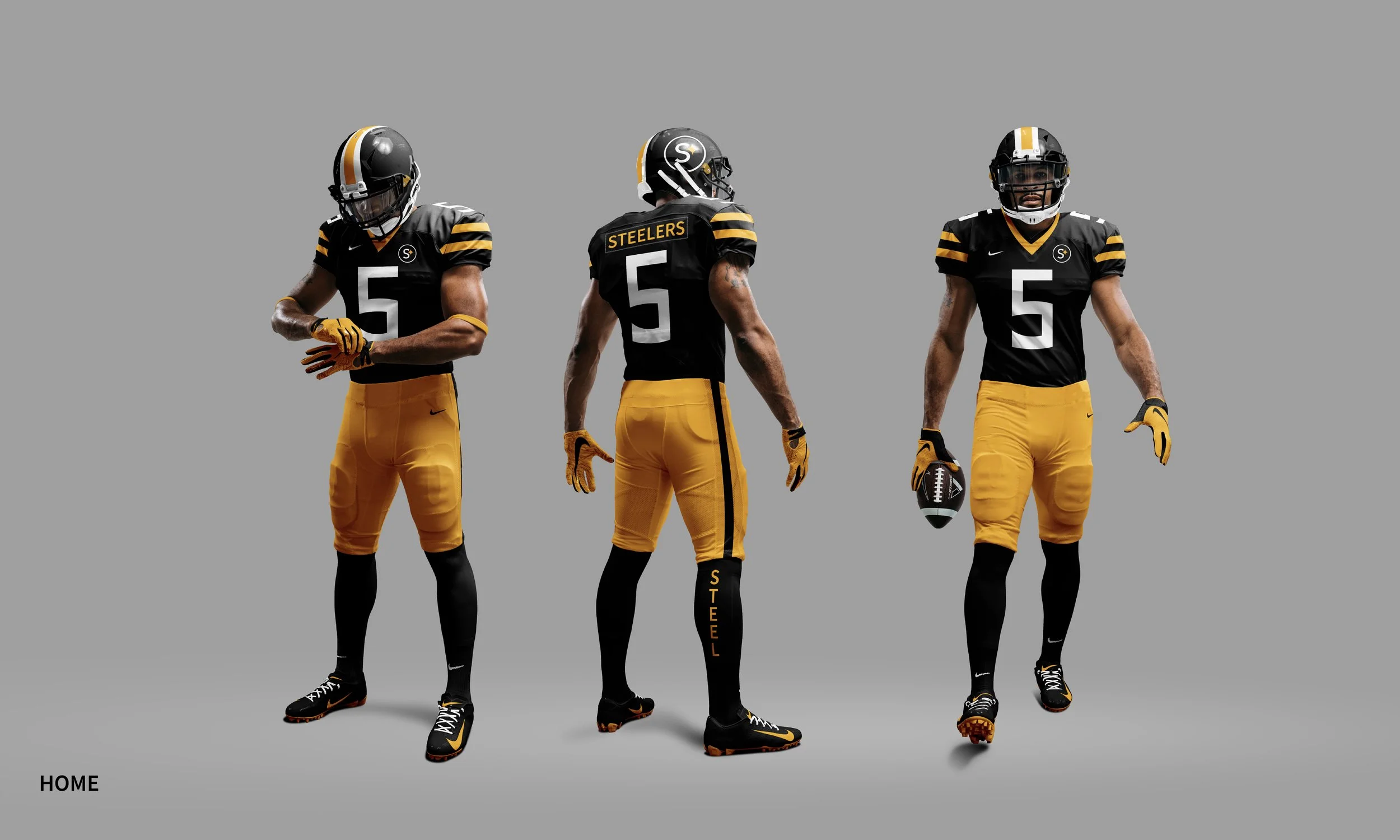
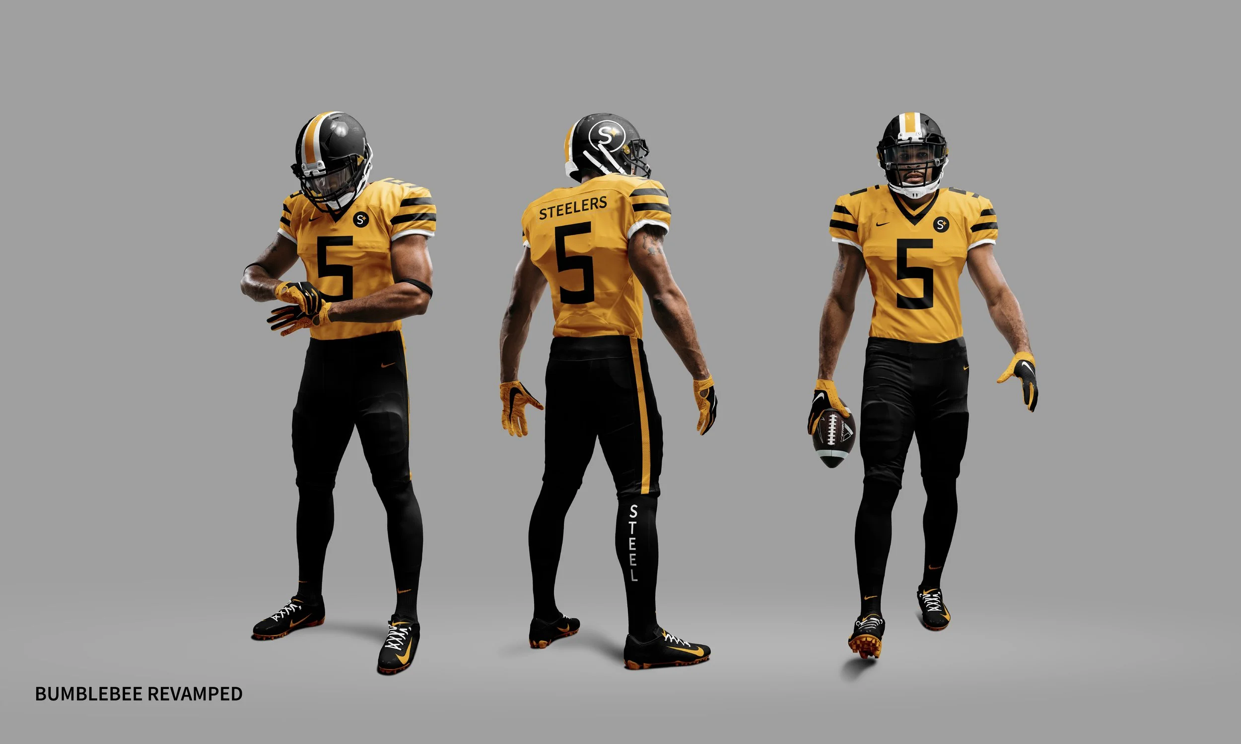
Uniforms + Helmets
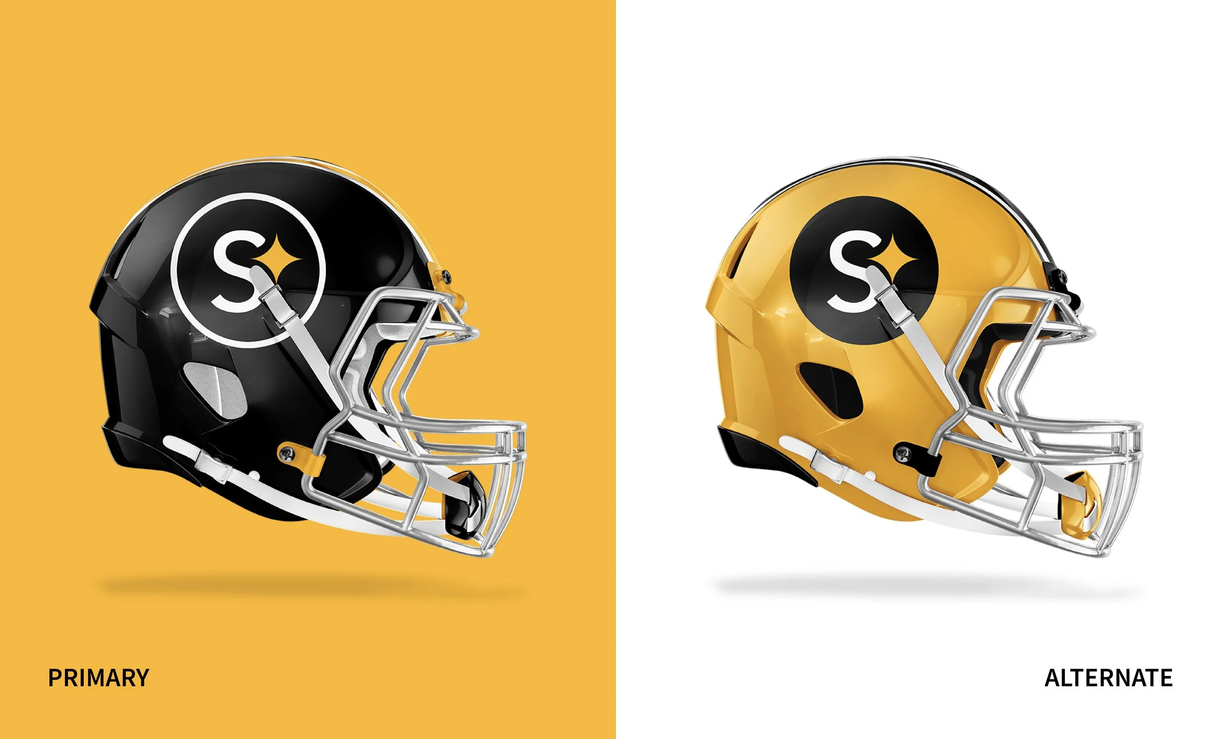
Helmets
The helmet redesign is cohesive within the branding. When placed against a black background, a thick white stroke may be added around the circle.
The logomark will continue to be placed on the right side of the helmet, sticking with the Steeler tradition.

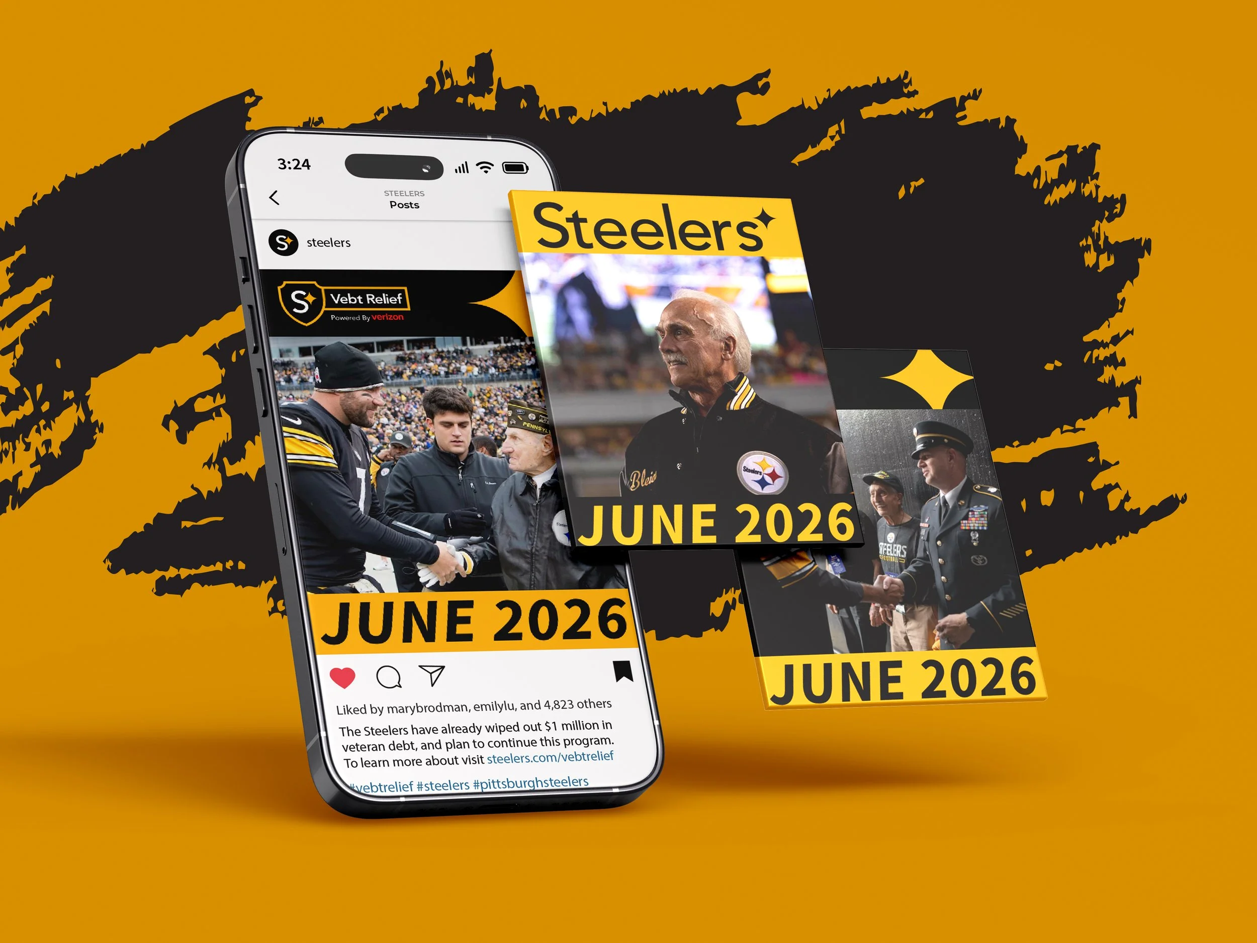


Brand Patterns


New established patterns for the brand may be utilized for digital, print, and product design. Patterns may be used for packaging, media content, merchandise, and advertising.